
Over the years, Singapore’s train network has evolved from a humble two-line system into a convenient and reliable train network that spans over 260 kilometres across the country.
The system map has been constantly updated to reflect changes to the train network, such as the opening of new MRT lines, along with the addition of new stations and interchanges.
SEE ALSO: Current MRT/LRT System Map »
Interested in reading more of our future posts?
Follow us on Facebook, Instagram, WhatsApp, and Telegram for the latest updates!
System Maps Over the Years
1990 — The North-South Line and East-West Line

Recreation of the old Singapore MRT Route Map by Calvin Teo
The maps from the completion of the initial system in 1990 depict each bound as a separate colour for navigating the train network, which opened three years earlier in 1987.
LEARN MORE: History of the MRT System »
MRT stations were coded based on the region they are in — ‘E’ for East, ‘W’ for West, ‘N’ for North, ‘C’ for City, and ‘M’ for Marina. The branch line stations are prefixed with the letter B.
The branch line was then merged with the North-South Line (NSL) in 1996 with the opening of the Woodlands Extension.
Mini Fact: Every ninth station from the city centre — Jurong East, Ang Mo Kio, Tanah Merah, and Paya Lebar — is built with an additional platform to facilitate train withdrawals to the nearby train depot. It could be a mere coincidence, but nevertheless an interesting fact.
2003 — The North East Line, Changi Airport extension, and Dover station

System Map from 2006 with the opening of Buangkok station
The system map was revamped in 2002 to accommodate the new North East Line (NEL) and new stations on the East-West Line (EWL). Train lines were recoloured into one colour, and end-destination numbers were included, representing the direction of travel.
RELATED: Fun Fact Friday: End-Destination Numbers »
Stations were renumbered with a new prefix for each line, as well as the inclusion of nearby bus interchanges. Dover station also opened and was tagged with the station code ‘EW22’.
Reserved station codes were included from this system map onwards, hinting at future stations that could open along those train lines. Three station codes are missing on this map; try to spot them!
Mini Fact: Expo and Changi Airport stations were initially coded as ‘EW28’ and ‘EW29’, respectively. However, with plans to extend the EWL with the Boon Lay extension, the two stations were renumbered to ‘CG1’ and ‘CG2’, representing the Changi Airport extension.
2009 — The Circle Line

System Map from 2012 with the opening of the Circle Line Extension
The fourth MRT line, the Circle Line (CCL), coloured in orange (not yellow!), was added to the system map. There were no significant changes to the system map during this period.
Mini Fact: White text was initially paired with the CCL’s orange background. From 2013 onwards, the CCL’s text changed to black, and the orange accent also changed from a brighter to a darker orange for better contrast and legibility on real-world signage.
2013 — The 2nd revamp of the System Map with the Downtown Line

MRT System Map from 2019 with the opening of the Downtown Line Phase 3, and closing of Ten Mile Junction LRT Station
With the opening of the Downtown Line (DTL), the system map and various design elements were revamped in 2019. The Land Transport Authority (LTA) consulted with Transport Design Consultancy (TDC) to refresh the existing branding of the entire train network.
The introduction of new out-of-station interchanges at Bukit Panjang, Newton and Tampines stations on the DTL meant a redesign was needed to include such information; thus, a new station caplet design was implemented, improving the system map and wayfinding.
There were also enhancements to existing glyph icons, such as the new MRT and LRT pictograms and including stations near cruise centres.

Mini Fact: When TDC designed the new proposed system map, a grid system was utilised for the following diagrams, allowing the system map to be simplified and look neater. This allowed for more simpler additions and updates to the system map.
2020 – The 3rd revamp of the System Map with the Thomson-East Coast Line

MRT System Map from 2020 with the opening of the Thomson-East Coast Line
Coinciding with the launch of the Thomson-East Coast Line (TEL), the system map, design elements, and signage system were revamped once more for better wayfinding.
The CCL will intuitively serve as a focal point in the new map to help commuters quickly orientate themselves and plan their journeys. Contextual elements, such as prominent landmarks on the system map, will also help commuters identify their corresponding stations.
Station caplets are now prominently used as the identifying factor for the train network, as is the reduced emphasis on pictograms such as the end-destination numbers and MRT/LRT icons.
Our Version of the System Map
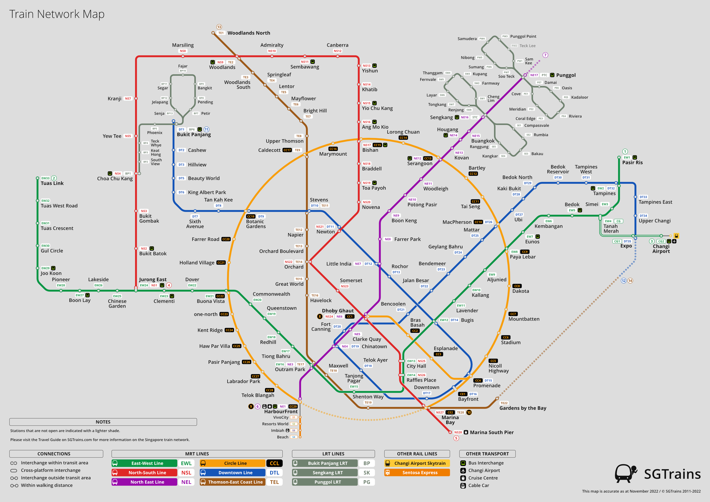
The SGTrains version of the system map was designed to closely relate to the current system maps in stations with our improvements.
One feature we included pertains to the interchange nodes, where the link between the station nodes corresponds to how interchange stations are linked in the real world.
This allows small transfer time savings, especially helpful if you are chasing for the last train!

Interchange nodes used to be part of our old system maps, which were a useful feature. A simplistic caplet design helps to simplify the system map, creating a cleaner look.
At the end of the day, there is no definite correct way of designing a train system map — but we designers feel that these maps must convey the intent of our minds.
LEARN MORE: Singapore Train Network »
Recent Posts
Singapore’s Circle Line has finally gone full circle; three new CCL6 stations open on Jul 12, 2026
Downtown Line to end earlier on Fridays, start later on Saturdays, from Jul 10 to Sep 5, 2026
Circle Line Stage 6 public preview on Jul 4, 2026; explore 3 new CCL6 stations with free MRT rides
Interested in reading more of our future posts?
Follow us on Facebook, Instagram, WhatsApp, and Telegram for the latest updates!
Related Links
Train Network Map – SGTrains
History of the MRT System – SGTrains
Network: Figures at a Glance – SGTrains
This article first appeared on SGTrains.
Last updated on 07 Sep 2024.